If your email marketing messages are not easy to read on a mobile device, you may be losing over half of your targeted audience. A recent report by our friends at Litmus noted that in the month of November 51% of all email opens were from a mobile device! Especially during this time of the year, when consumers open their wallets more than usual, it is important that every message makes the impression you want.
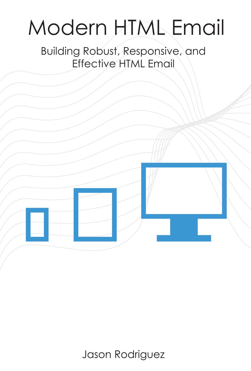
Here at SocketLabs we want all of our clients to get the best possible results from their campaigns, regardless of how the recipients are reading messages. While staying in tune with what is happening in the email industry, we came across a book this summer called Modern HTML Email by Jason Rodriguez. We were so impressed with the book that we wanted to get in touch with Jason and ask him to share some of his insights with our clients. Prior to his current position as Community Manager for Litmus, Jason honed his skills over the last few years by working on email marketing campaigns with millions of subscribers for a Fortune 100 company.
Here are a few questions that we asked Jason:
Statistics seem to imply that mobile email views are continuing to increase. Does that mean that everyone should be designing with a “Mobile First” mindset?
Everyone should absolutely be designing with mobile in mind. Not everyone needs a fully responsive design, but even emails with a large number of desktop readers should still be “mobile-aware” and work well on mobile devices.
A huge part of email marketing is knowing your audience and where they are opening your email – it’s never the same across industries. If your audience is primarily mobile, your emails better be, too. If your audience is chained to the desktop, target those clients.
Just keep in mind that there is always a percentage of any audience that is mobile and that group is always growing. If your email breaks or looks terrible to them, you’ll quickly lose those subscribers and their business.
What does it mean when an email has a responsive design?
Responsive emails take the device out of the equation. While some designers create mobile-aware or fluid emails, responsive emails go one step further and use fluid tables, fluid images, and CSS media queries to provide an optimized email across a wide range of devices – from handheld to desktop.
What is a Media Query?
Media Queries are CSS3 rules that allow designers to target very specific things like screen size, device size, pixel density, device orientation, etc.
Coupled with fluid tables and fluid images, they are how we implement responsive designs and optimize emails for a wide variety of devices.
Does an email need to be built responsively to be successful on a mobile device?
Absolutely not! While responsive emails provide the most control across devices, there are a few ways to make emails work on mobile devices without going fully responsive.
Mobile-Aware emails are similar to your run-of-the-mill desktop emails, but they keep mobile in mind from the beginning. Mobile-aware emails keep things like text, images, and buttons readable and tappable on mobile devices, even if the layout doesn’t change and is just scaled down by the device.
Fluid (or adaptive) emails take that desktop layout and make the tables and images fluid so that they flow nicely on mobile devices, without using media queries to change the layout or content of an email on mobile devices.
Both methods are great ways to ensure your emails are successful on both desktop and mobile without having to build and test a fully responsive design.
What are some simple things that can be done to make a more mobile friendly email design without having to rebuild a message template from scratch?
There are four main things you can do to keep any email mobile-friendly:
1. Keep your text large enough to be read on a mobile device – even when scaled down. On that same note, keep your copy short and to the point. Small chunks of text are easier to digest on mobile and should be used to entice readers to tap through to where you want them – your landing page.
2. Keep images mobile-friendly. Don’t include a lot of text in images – chances are it will be unreadable when mobile devices scale down your email. Use images to emphasize your point, not make it.
3. Make your calls to action usable on mobile devices. Apple recommends touch targets be 44px by 44px – so keep any buttons at least that size. Make sure text links and CTAs have enough spacing around them so they are easily touched. Nothing is more frustrating on mobile than trying to click on tightly packed links. Never frustrate your users.
4. Always test! Use Litmus to see how your emails render on mobile devices and adjust content and design accordingly. Whenever you can, try out your email on an actual device, too.
.
Hopefully these questions and answers help get you building the mobile-friendly emails your users are clamoring for! SocketLabs wants to thank Jason for providing his insights. For more information about email design, be sure to pick up a copy of Jason’s book Modern HTML Email. For help troubleshooting your designs, you can also check out the ultimate suite of email rendering and testing tools from Litmus.


