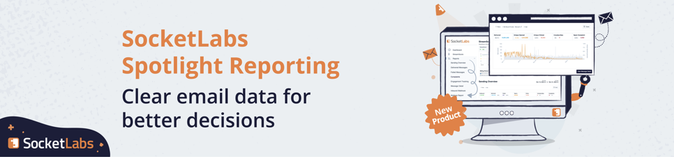
We just released a new SocketLabs On-Demand Control Panel update and we are excited to tell you about it! Since our major Control Panel update last month we have been hard at work making our reporting interface more powerful and even more useful to our customers. The most advanced SMTP relay service reporting interface, just got better!
The Control Panel reports for each of your cloud SMTP servers now features new and improved graphs, charts, and analytical data. Here is a summary of what’s new on each report:
Delivered Messages
The Delivered Messages report provides both an overall “total delivered” number based on the date range selected, as well as a line graph of delivered outbound messages over time. If you tag your email with a Mailing ID you can now narrow the displayed results by selecting a specific Mailing ID from the drop down box. The Mailing ID drop down is pre-populated with your most recently used Mailing IDs.

Failed Messages Report
In the Failed Messages report we’ve added both a pie chart breakdown of failure types with percentages displayed when you mouse over a particular pie section. This chart is in addition to the line graph that was previously part of the report page. Again, we have added the ability to narrow the failures by Mailing ID.

Engagement Tracking Report
The updates to the Engagement Tracking report may provide the most powerful and useful updates to the reporting system. The report will now display total sent, opens, clicks, and unsubscribes over the date range specified, as well as a line graph representation of each event. The big, easy-to-read display on the left shows the percentage of each event type compared with the total outbound messages sent over that period. This is your “rate” and is very useful information for analyzing your mailstream. You can also apply uniqueness to this data by selecting First Events Only from the Options drop down box.
Selecting First Events Only will calculate the total number of events and percentages over that time period based on the first occurrence of an event for each sent outbound message. This gives you an “engagement rate” that shows how many people are viewing your message OR clicking tracked links in your email. You can also apply a filter by selecting a specific Mailing ID from the Mailing ID drop down box. These new analytical tools provide great insights into how your customers are interacting with your various campaigns or different classes of email.

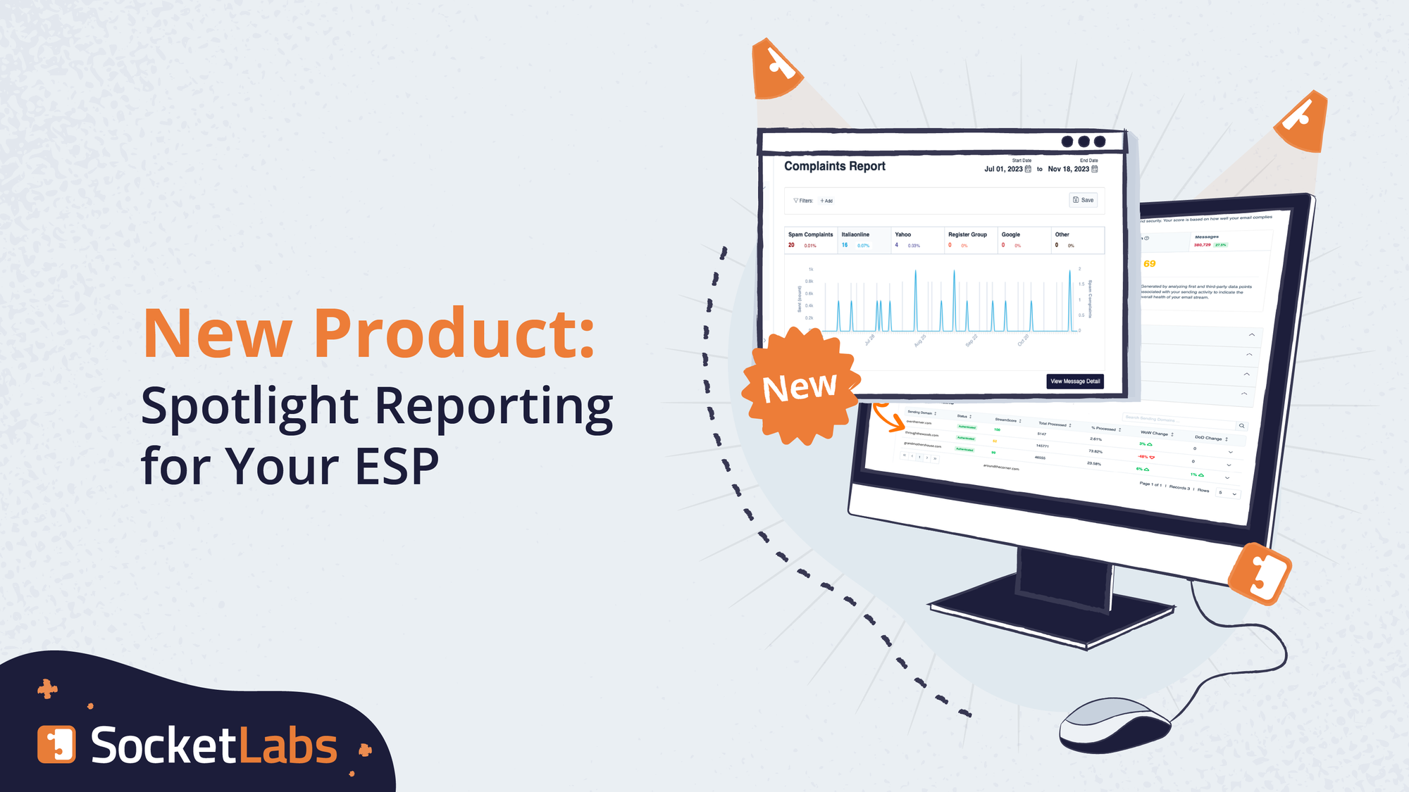
Complaints Report
The Complaints report has been updated to include both a new line graph and a pie chart of complaints broken down by ISP. We currently breakdown complaints by Yahoo, Hotmail, AOL, Comcast, Cox, and Roadrunner. By hovering your mouse over the pie chart it will display the number of complaints and the percentage of total complaints to that ISP.

At SocketLabs we pride ourselves in having the best online reporting systems of any SMTP provider on the market and we think this new release sets the bar even higher. Look for more exciting changes, updates, and new features to the SocketLabs On-Demand Control Panel in the coming weeks.